The Value of Visible Design
The best products — especially AI-powered ones — aren't invisible.
I'm pretty sure I've been guilty of preaching the "invisible design" gospel at least a dozen times. You know the one — where we nod along sagely about how the best interface is no interface, clutching our copies of Don't Make Me Think like they're sacred texts. Then last week, while prototyping an AI-assisted search experience that actually shows its thinking process, it hit me: we've been getting this completely wrong.
The philosophy trap
Here's the thing about invisible design — it sounds brilliant in conference talks. Designers love dropping Heidegger references ? about "readiness-at-hand" versus "presence-at-hand." (Stay with me here, I promise this gets less pretentious.) Basically, when you're writing with a pen and forget it exists, that's readiness-at-hand. When the pen runs out of ink and you suddenly notice its weight, color, that chewed cap — that's presence-at-hand.
We've convinced ourselves that making tools disappear is peak design. But I watched something fascinating unfold at a client's call center that completely shattered this idea.
Terrible becomes invisible
Picture this: customer service reps absolutely flying through the most horrific green-screen, command-line interface you've ever seen. Function keys, cryptic codes, tabs that made no sense. It looked like something from 1987 that nobody bothered updating.
But here's where it gets interesting...
When I asked these folks how we could improve their system, they just shrugged. This nightmare had become invisible to them through sheer repetition. They'd adapted so completely that the terrible design had achieved that coveted readiness-at-hand state we're all chasing.
Turns out, humans are remarkably good at making even the worst designs disappear through muscle memory. Which raises an uncomfortable question: if terrible design can become invisible, is invisibility really the goal?
The iPod moment
Remember the original iPod click wheel? That beautiful, circular interface that made scrolling through thousands of songs feel like magic? Apple could have hidden it behind voice commands or gesture controls. They could have made it "invisible."
Instead, they made it gorgeous. And visible. Gloriously, unapologetically visible.
The wheel's physical presence actually enhanced its function. You could feel the acceleration as you spun faster. The tactile feedback made the experience better, not worse. The design didn't disappear — it amplified the joy of finding that perfect song.

Point is, when design is so pleasurable that it makes the task itself more enjoyable, that's not invisible design. That's brilliant design.
Zero to one
I often get the raised eyebrows in design reviews — you know the look. It usually comes right after I've coded up a working prototype from scratch, built the interaction model, and shipped it to production. "Wait, you actually built this yourself?"
Yeah, I built it. From zero to one. The surprise never quite lands the way they think it does.
But here's why this matters for the invisible design debate: when you can actually build the thing, when you understand the technical constraints and possibilities, you realize that visibility isn't just about aesthetics. It's about affordances. It's about feedback loops. It's about making the system's capabilities discoverable.
The designers who ship, who get their hands dirty in code — we know that invisible often means inaccessible.
Search needs visibility
The big tech companies are wrestling with this exact tension. AI can now process queries in ways that feel like magic — understanding context, intent, even anticipating what you'll ask next. The temptation is to hide all that intelligence behind a simple search box. Keep it invisible. Keep it "clean."
But here's what's becoming clear: users actually want to see the AI thinking. They want to understand how we got from their messy, half-formed query to exactly the right answer. When the reasoning is visible — the knowledge graph connections, the inference steps, the alternative paths considered — people trust the results more.
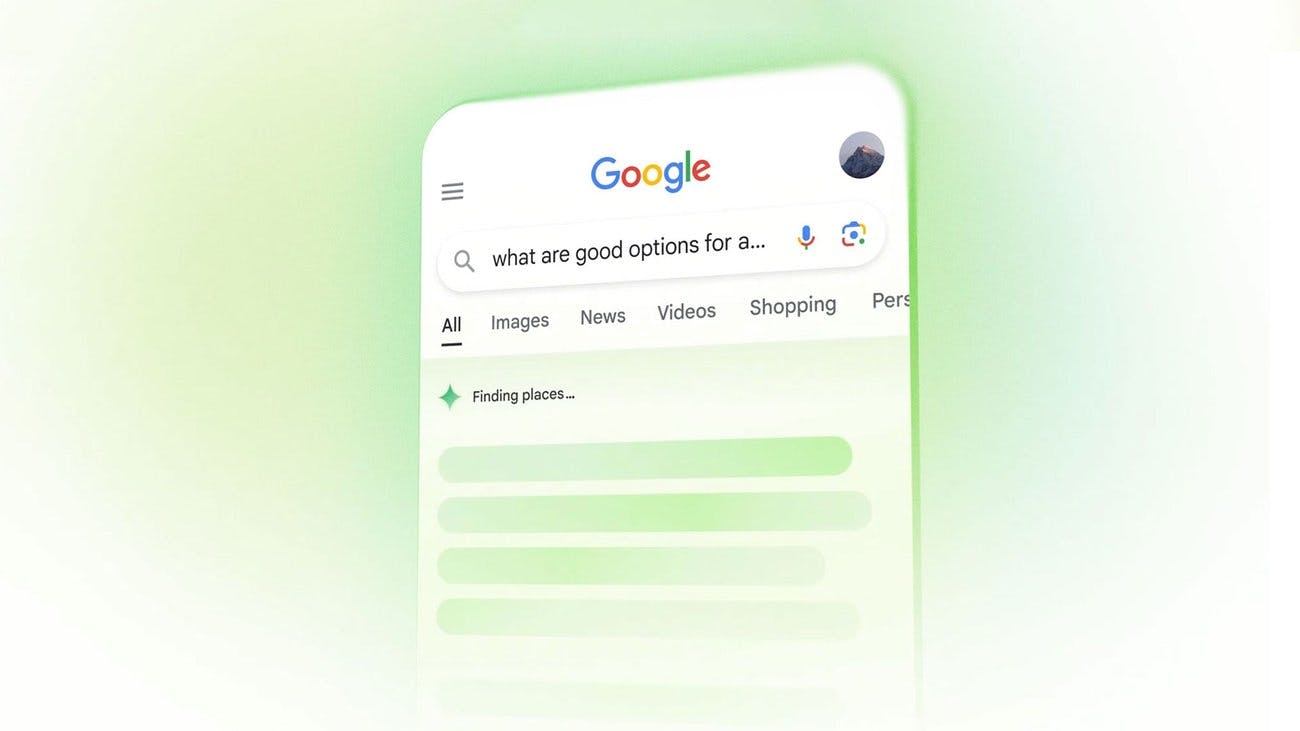
The same executives who initially pushed for "cleaner" interfaces are now asking for more transparency into the AI's process. Turns out, making intelligence visible makes it more valuable, not less.
The LLM problem
We've all wrestled with AI interfaces, right? "Help me with... no, not that... wait, what can you actually do?"
By removing all visual elements, we've actually made things harder. The depth of what these models can do remains hidden because there's nothing to see, nothing to explore. No visual affordances to guide users toward the AI's true capabilities.
Ever notice how people default to using ChatGPT like it's Google circa 2005? Simple keyword searches when it could be doing complex reasoning? That's what happens when invisible design fails. We literally have to teach people what's possible because the interface gives no clues.
Sometimes we need that friction. We need to see our options.
Breaking trust
Microsoft learned this the hard way with their adaptive menus — remember those? We're about to learn it again with AI.
When AI makes decisions invisibly — reranking results, filtering options, personalizing experiences — users lose trust. They can't tell if the AI is helping or limiting them. They don't know what they're not seeing.
What actually builds trust? Showing the work. Making the AI's reasoning visible, even if users don't always engage with it. The presence of that visibility, that option to peek behind the curtain, changes everything.
Three things matter
After years of chasing invisibility, here's what I've learned actually matters in design:
Making something beautiful — because joy matters, especially when AI can feel cold Making something easier — because AI complexity needs human simplicity
Making something possible — because AI's capabilities need to be discoverable

The best designs nail all three simultaneously. Sometimes that means making elements invisible. But increasingly, it means making AI's intelligence deliberately, thoughtfully, beautifully visible.
Moving forward
Right now, I'm prototyping experiences where AI explains its reasoning in real-time. Every inference has weight, visual feedback, a trail you can follow. It's aggressively present. And you know what? Users love it. The visibility enhances trust rather than detracting from it.
That's the real insight here. We've been so focused on making design disappear that we forgot to ask whether disappearing actually makes things better. Sometimes the most delightful experiences come from understanding what's happening — seeing the intelligence at work, appreciating the complexity being handled on your behalf.
As we move toward spatial computing and AR glasses, this question becomes even more critical. Do we hide AI's intelligence in the background, or do we make it a visible partner in the experience? Do we make the digital layer invisible, or thoughtfully, selectively visible?
Who knows where design philosophy will swing next, but I'm done apologizing for visible design. The best products — especially AI-powered ones — aren't invisible. They're as visible as they need to be to build trust, enable discovery, and make life a little better.
The future isn't about hiding intelligence. It's about making it beautiful.
Acknowledgments
Thank you for reading this far. You are the real MVP.
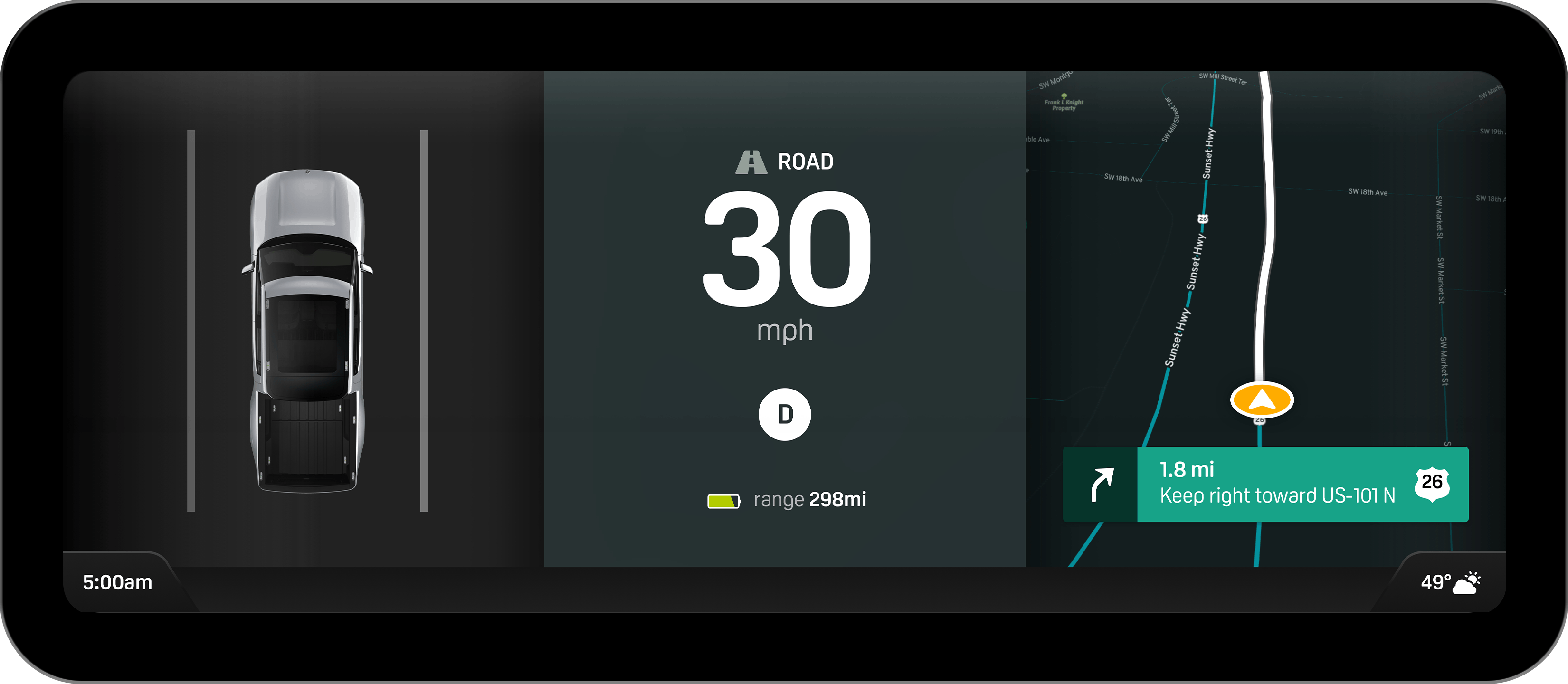
And if anyone would like to gift me a Rivian...here you go